Stepping up your Sketching + Gouache Process
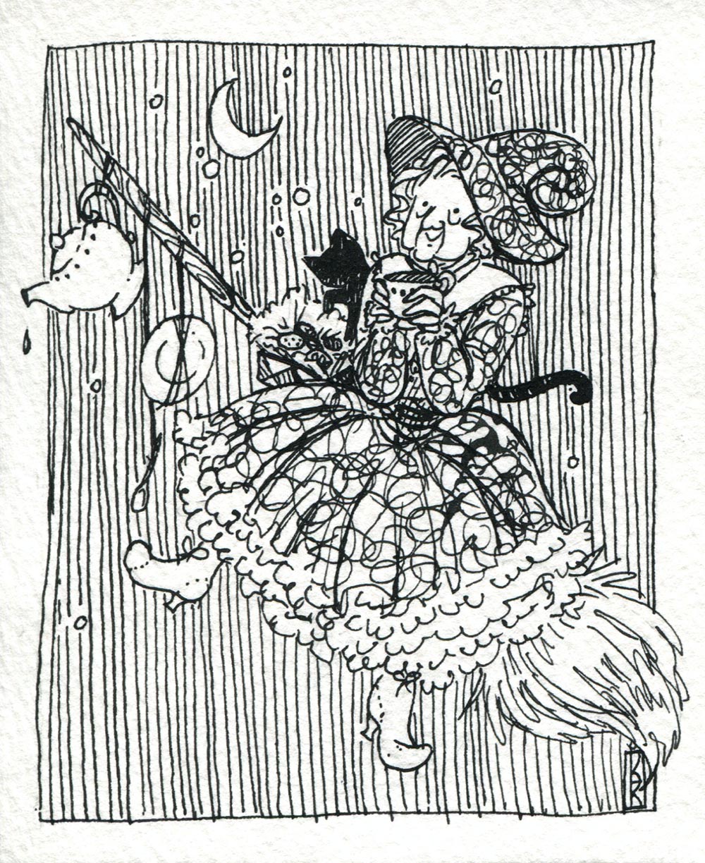
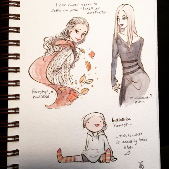
I love looking at other artists' sketchbooks, whether in person or online, via social media platforms like tumblr or instagram. Sketches give a unique look into an artist's thought process and method. While some sketch in pencil, many more take their sketches to the next level with ink+brush, gouache, or charcoal on toned paper (to name but a few). This change in media may seem small, but it can have a huge impact on your sketches and really take your "silly doodles" to the next level!
While cultivating a portfolio, the goal is always to make your work look professional (fake it 'til you make it, right?). And with social media becoming a larger and larger part of marketing and making connections, it's important to carry that professionalism over into the sketches and "rough work" you show too. Sure, your lines can still be loose and messy, but a simple change of medium can help your doodles really shine.
Lately I've been doing more gouache sketches. These quick and simple paintings help me focus more on shape, color, and pattern since I don't use any line work etc. Below is a step-by-step look at the process I use. For this painting, I used acrylic gouache, which dries quite quickly, forcing me to work fast and really commit to the colors and shapes I put down.

1. I start off with a wash of aqua for the base. Some artists prefer to put down their sketch layer first and then seal it in with a very light wash, but since I'm using opaque acrylic gouache, I decided to put the sketch on top of the color once it was dry. This aqua is actually straight from the tube, which made it easier to clean up edges/stray marks at the end. While I rarely use color straight from the tube, I take exception when I want a painting to be A) extra colorful/bright or B) fast.
I keep my sketches minimal and very light--blotting them with a kneaded eraser so that they're barely visible. (This comes from working primarily in watercolor, where you want your sketch to be so faint it's almost invisible.) Also, if you have too much graphite in your sketch, your paints will pick up its grey pigment.

2. Starting with the objects in the very back of the painting, I start to block in the colors. I decided to have the pineapple be a gradient of yellow to orange/coral so that the light-colored dole whip (the midground) would stand out more. Since I'm painting yellows/oranges on blue, I had to use a few coats to get the color pure and not so muddy looking.
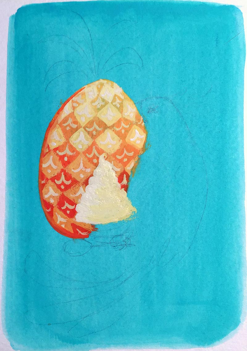
3. Start playing around with patterns/textures for your background object(s). Remember that it will be easier to experiment now, before you paint the top layers (in this case, the bird). Then I block in the dole whip with light, buttery yellows, starting to get that swirled look with my brushstrokes.

4. Add more detail to your midground (dole whip), and then block in the colors of the foreground (bird). As with the pineapple, since I painted a white bird on a blue background, it took several coats to get the color bright and pure like I wanted.
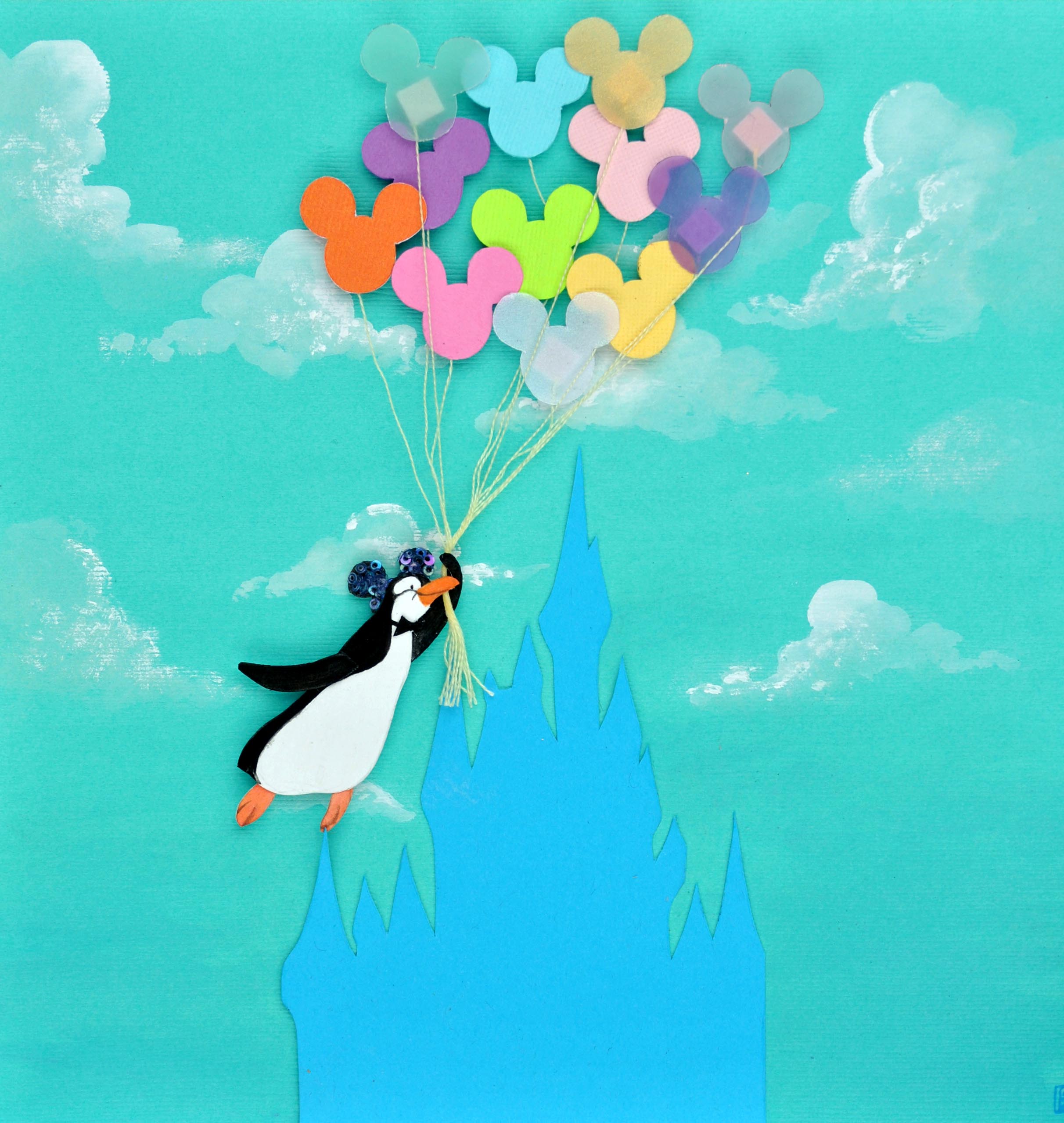
I also gave Miss Birdie an eye, because I find it much easier to paint things that "have a soul," so to speak. People/animals/etc. really come to life once you give them eyes; it's usually at this stage that they'll start telling me who they want to be, their personality shining through with every detail and line.

5. Almost done! The more I paint Miss Birdie, the more I come to understand who she is, what kind of personality she has. With each pass, I add more detail to the painting. Remember that detail, like color, can draw your viewer's eye to a certain spot, so try to focus it wisely. Here, I use it to point to both the bird's face and the dole whip.
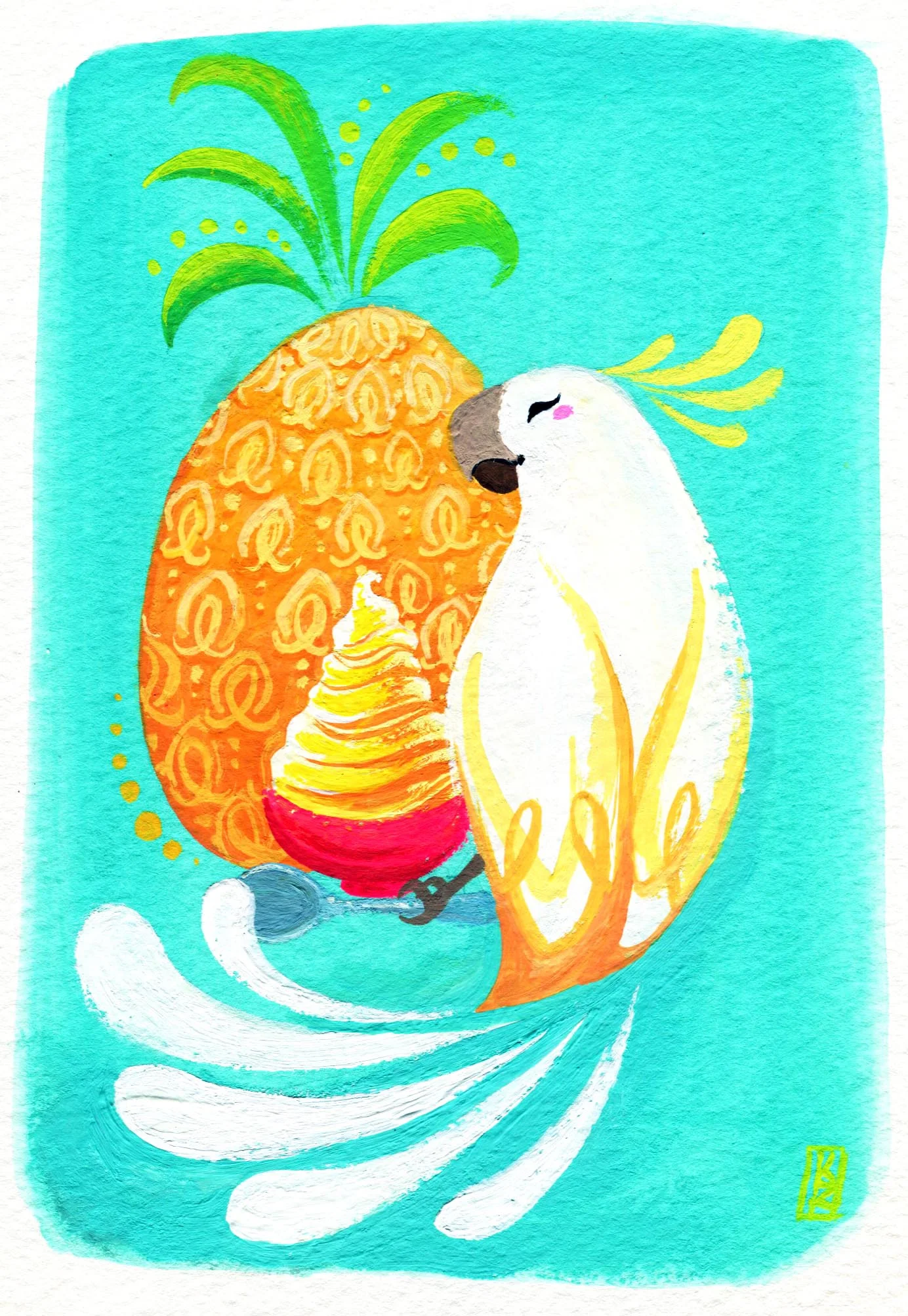
6. All finished! As you can see, I changed my mind a few times before I arrived at the final painting. Namely, changing the texture on the pineapple and having the birds feathers all separate from the body. The nice thing about acrylic gouache is that, like regular acrylic, you can simply paint over mistakes and keep going (though the paint builds up rather quickly, giving it a distinct texture, unlike acrylic, whose layers tend to lay smooth).
Note: This image shows the colors more clearly since it's a scan, rather than a quick phone picture.
So the next time you feel like doodling, try adding color, or sketching in a new medium. You never know what happy accidents you may find!