The Journey of a Map
Mapmaking is not only a practical pursuit for me as a writer, it’s also meditative for me as an illustrator.
All of the maps for my books begin as very rough sketches in notebooks. The below map is for my fantasy duology, Flowers of Poison. The notebook for these books is a lovely handmade book: leather bound with handmade paper, which made for fun aesthetics, but horrible sketching. I lovingly refer to my book maps as my “Happy Mappy”s as generally, they’re my reward for revising and editing.
I’ve worked on these books on and off for 10 years, and in that time, have started a few maps that went nowhere, such as below.
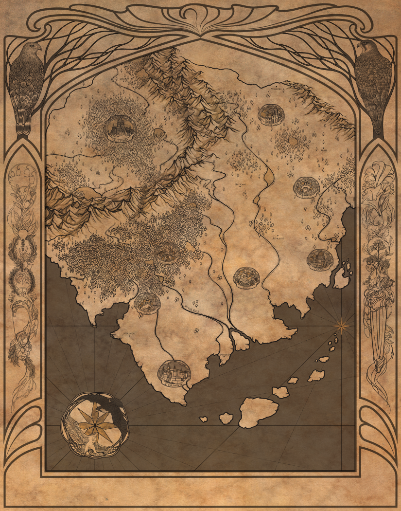
As I worked on revising the latest drafts, however, I decided it was high time I made a proper—digital—map. Creating the map digitally has several advantages, chief among them being the ability to edit. Over the last 10 years, the books have undergone enormous changes, which meant that the map has changed too. I needed to be able to continue tweaking the map as the books grew and evolved. This is one great advantage of digital maps over traditional. For this map, I used mostly Adobe Photoshop with Adobe Illustrator for certain elements.
After creating a background texture with watercolors, I scanned it and set it as the base layer in the PS file. Then, I began the long process of drawing the major map elements: borders, mountains, forests, and water. And yes, each of those trees is individually drawn: coniferous closer to the mountains and in the North, deciduous farther from the mountains and toward the South. In the future, I’ll likely create brushes or clone stamps for the trees, but as the forests are an integral part of the books, I wanted to take time to think deeply about them: how and where they grew, how they were cut back, how the forests regrew and adapted after disasters, etc..
I used a deep sepia for the lines, as it would blend better with the background texture and provide more of an antiqued feel, rather than a stark black.
One of my favorite parts of mapmaking is the detail I’m able to hide in the ornament. For this map, I knew that I wanted the compass rose to feature a falcon and a hawk: the main characters’ familiars. Initially, I thought to put them on an art nouveau style circle, but ended up deciding to go with a simpler knotwork frame, to match the city labels. For me, it’s helpful to do the rough sketches in multiple colors to help distinguish the overlapping elements.
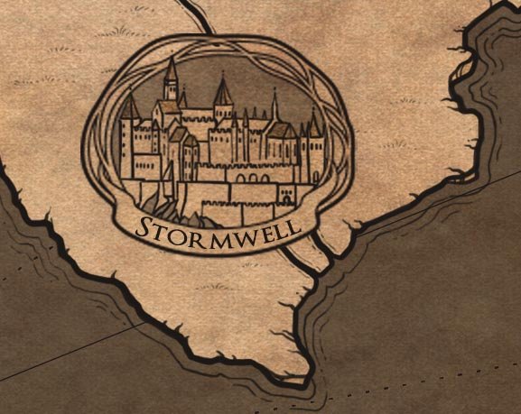
At this point, I also sketched tiny icons to give a sense of each city and village. One of my favorite fantasy cartographers, Misty Beee, makes gorgeous city labels, and I shamelessly stole her idea. I added simple values to help further define my doodly buildings.
Using sepia tones on a separate layer, I painted loose shading on the mountains to give them more depth and dimension and to help make sense of those masses of squiggly lines (more on this in the next post). I also added simple shading to the compass rose to further define it.
Frames are in no way necessary for maps, but as an illustrator, I love the chance to add more narrative details. I created the framework, flowing branches, and roots in Illustrator, as this gave me an easy way to get clean symmetrical lines. I also created the town labels, name scrolls, radiating compass lines, and compass rose wreath in Illustrator to achieve the same clean line work.
Then I began the fun process of filling the frame in what was certainly not procrastination from editing the actual books.
The red-shouldered hawk and peregrine falcon from the compass rose are repeated here, along with two stylized perfume bottles. The two main characters in the books are both perfumers, so I wanted to illustrate their signature scents somehow.
The challenge of illustrating perfume is immense: how to capture in pictures something so fleeting and ethereal? In the end, I decided to create art nouveau knotwork of each perfume’s main notes/ingredients, with bottles designed to express each character’s personality. On the left is a forest fougere with a bottle decorated with hawks, a tree, and curling seeds. On the right is a perfume of poison florals with a bottle composed of sweeping daturas and a dagger applicator.
One of the last things I did to add further value to the map, and thus help it not be so flat, was to add sheer layers of color (i.e. paint in the areas with a hard opaque brush, then set the layer opacity to somewhere between 20-65%). I used white overlays over the land masses and datura to bring them forward, and sepia overlays over the water and frame elements to give contrast to the image overall.
I happened to finish my Happy Mappy the same day I finished revisions for the duology. After which I took a long, well deserved nap.
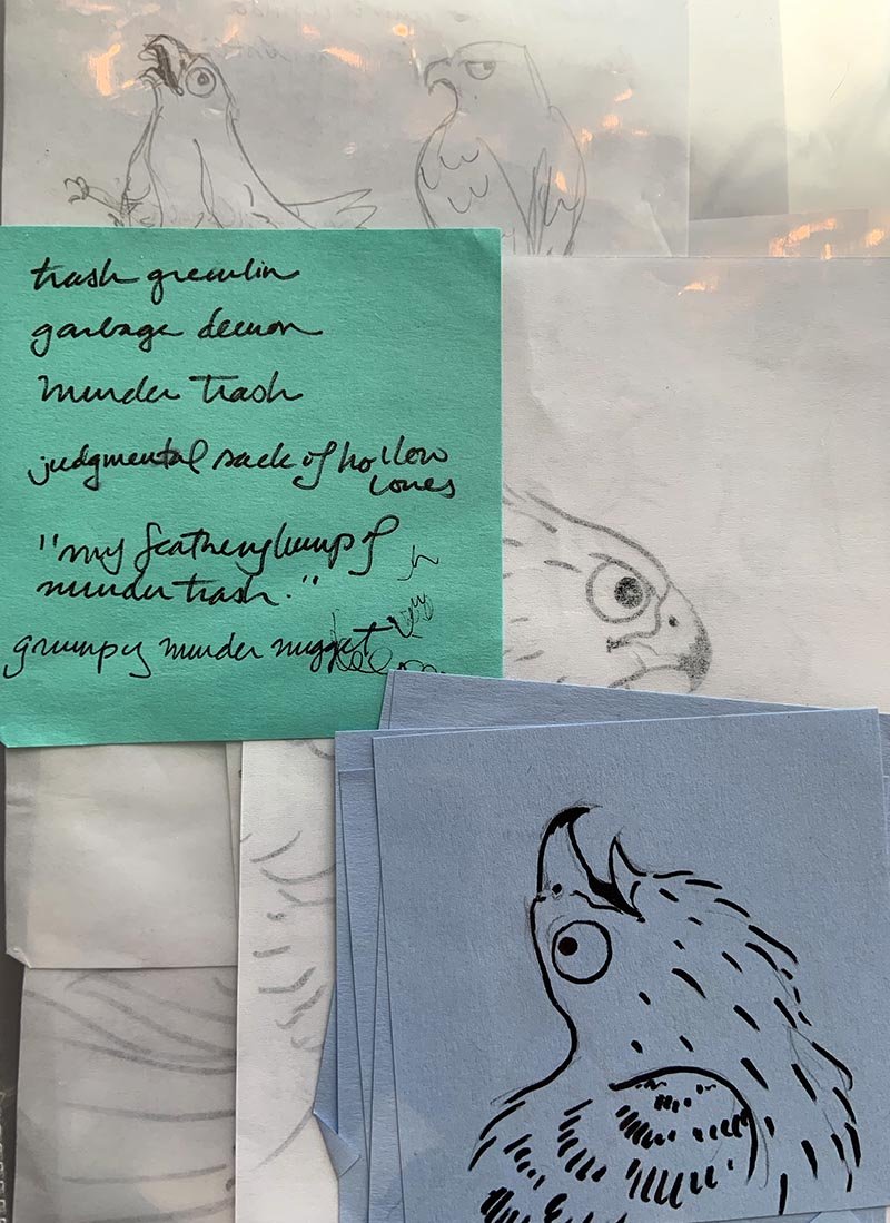
To reward you for reading all the way to the end, you get bonus Helen (sassy hawk) doodles.


