Dragon Sonnets Cover Process
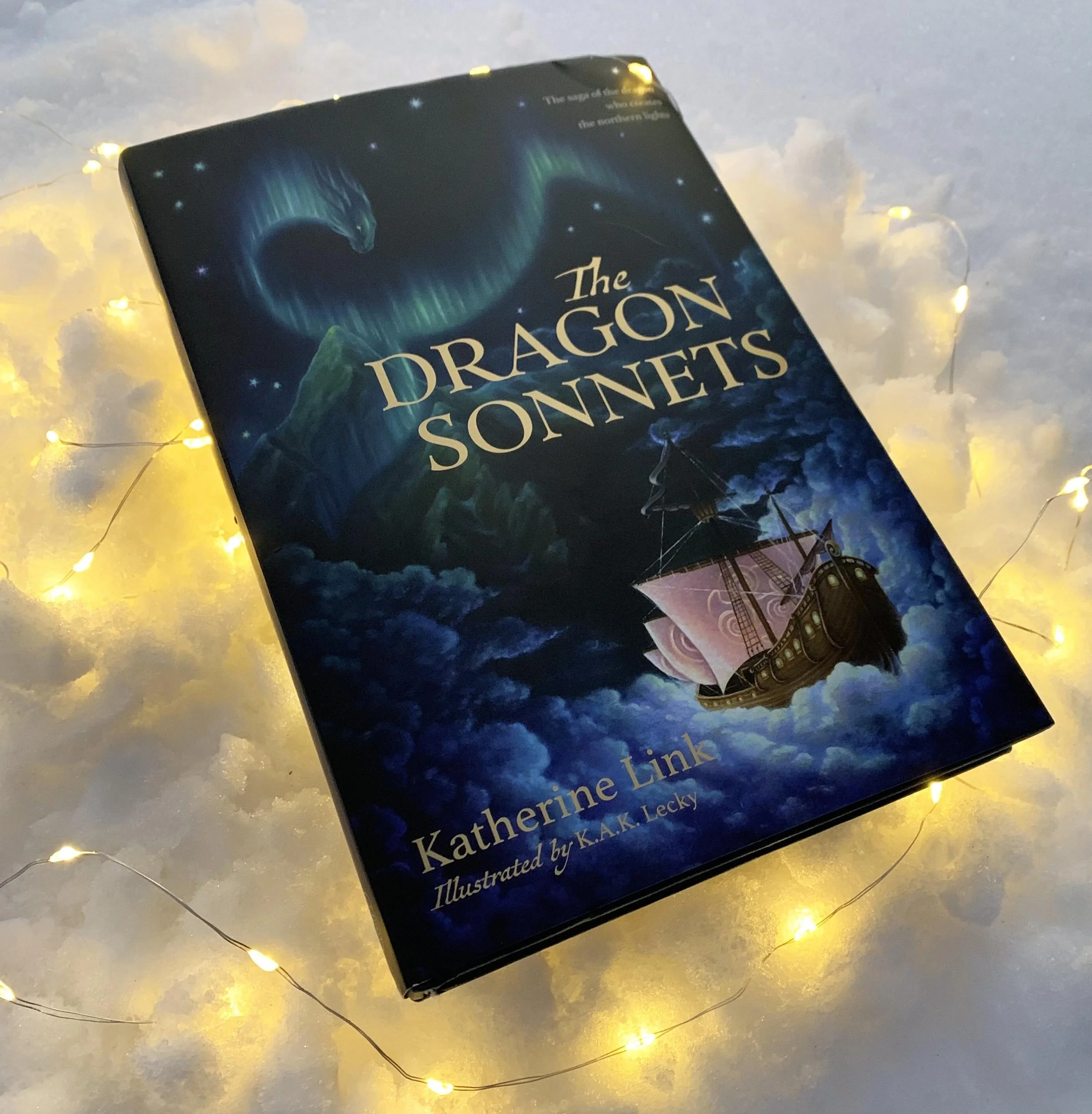
To celebrate the publication of Katherine Link’s The Dragon Sonnets, the magical tale of the dragon who creates the Northern Lights, here’s a behind-the-scenes look at the creation of the cover art.
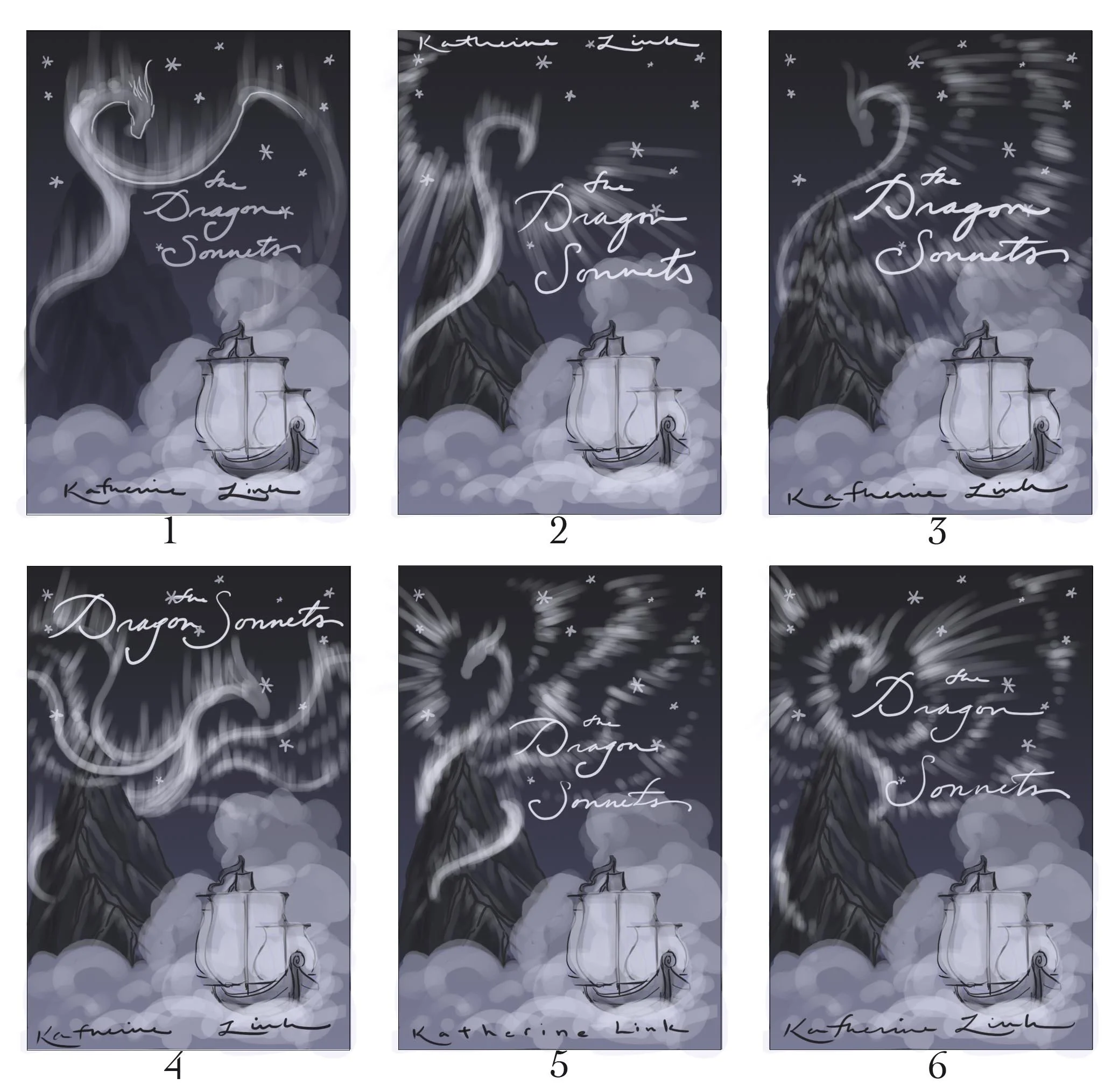
I begin every project with many rounds of sketches. This project was lovely in that I got to collaborate directly with the author (generally I work through art directors/editors/etc.). That allowed us to work through numerous ideas together, refining them until we arrived at the above (the 5th set of thumbnails, I think). While we had the main elements of the cover down, I had fun playing with different shapes/styles of auroras. Ultimately, we decided on 1, as it featured a clear dragon shape and enough negative space to let the title shine.
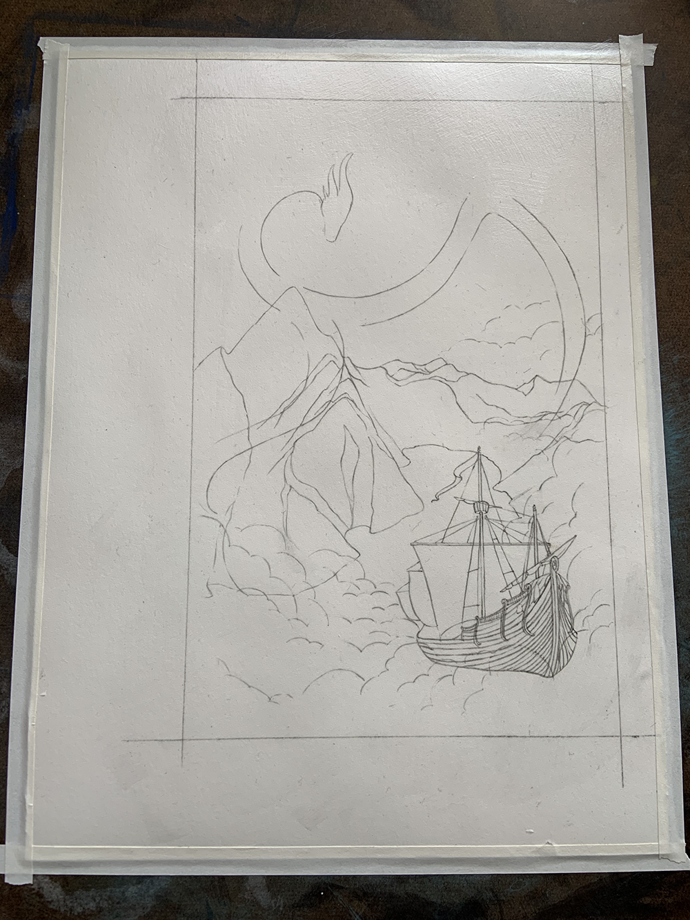
I prefer a smooth painting surface, so I primed a sheet of hot-press watercolor paper with GAC 100 (3 coats on each side to prevent warping), readying it for oils. After transferring the sketch, I sealed the pencil lines in with another coat of GAC to keep the graphite from smudging.
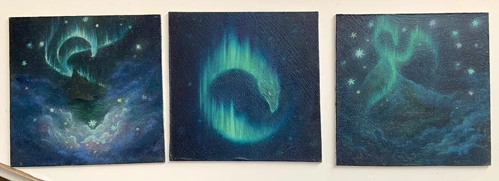
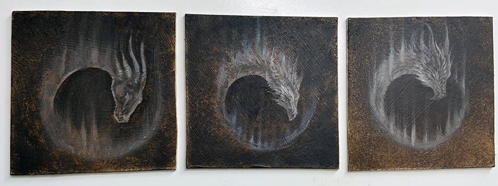
As this was my first major oil painting in years, I worked up several small (4x4”) studies first, to get an idea of how I wanted to build the layers, particularly for the auroras.
(Side note: these small originals are available for sale; email me at kakleckyillustration@gmail.com if interested.)
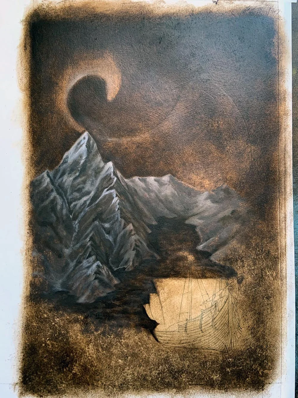
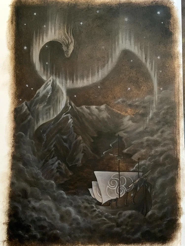
I don’t always do underpaintings, but they’re good at creating a deep, rich glow which I wanted for the aurora and night sky. Plus, underpaintings give me an opportunity to work out the values and light in a painting before getting into color. For underpaintings, I use only two colors: Old Holland’s Raw Umber and Titanium White.
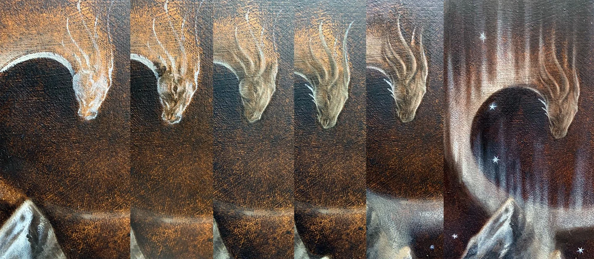
One aspect of the cover Kathy and I talked about at length was what the dragons should look like. Since dragons are the heroes of the book, we decided that they needed a wise, mystical aspect, as opposed to portrayals of dragons as terrifying monsters. After many experiments, we arrived at this idea of an equine-ish dragon head: regal, elegant, but also powerful.
The underpainting allowed me to work out the anatomy of the dragon’s head, even though much would be obscured in the final color passes. I began with a muscular horse head, over-emphasizing the contours and drawing the muzzle down into a more dragon-ish point. This was then accessorized with sweeping horns and spikes, to both flow with and also contrast the lines of the aurora.
Above you can see the completed underpainting. Usually I’d wait to paint clouds until the color glazes, but I wanted to establish the basic values and light for that part of the painting. The stars here are intentionally bright, as I knew they’d need to shine through multiple glazing passes.
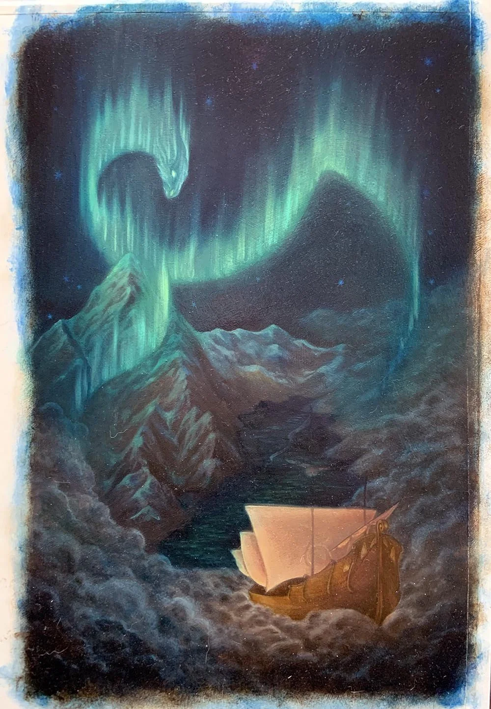
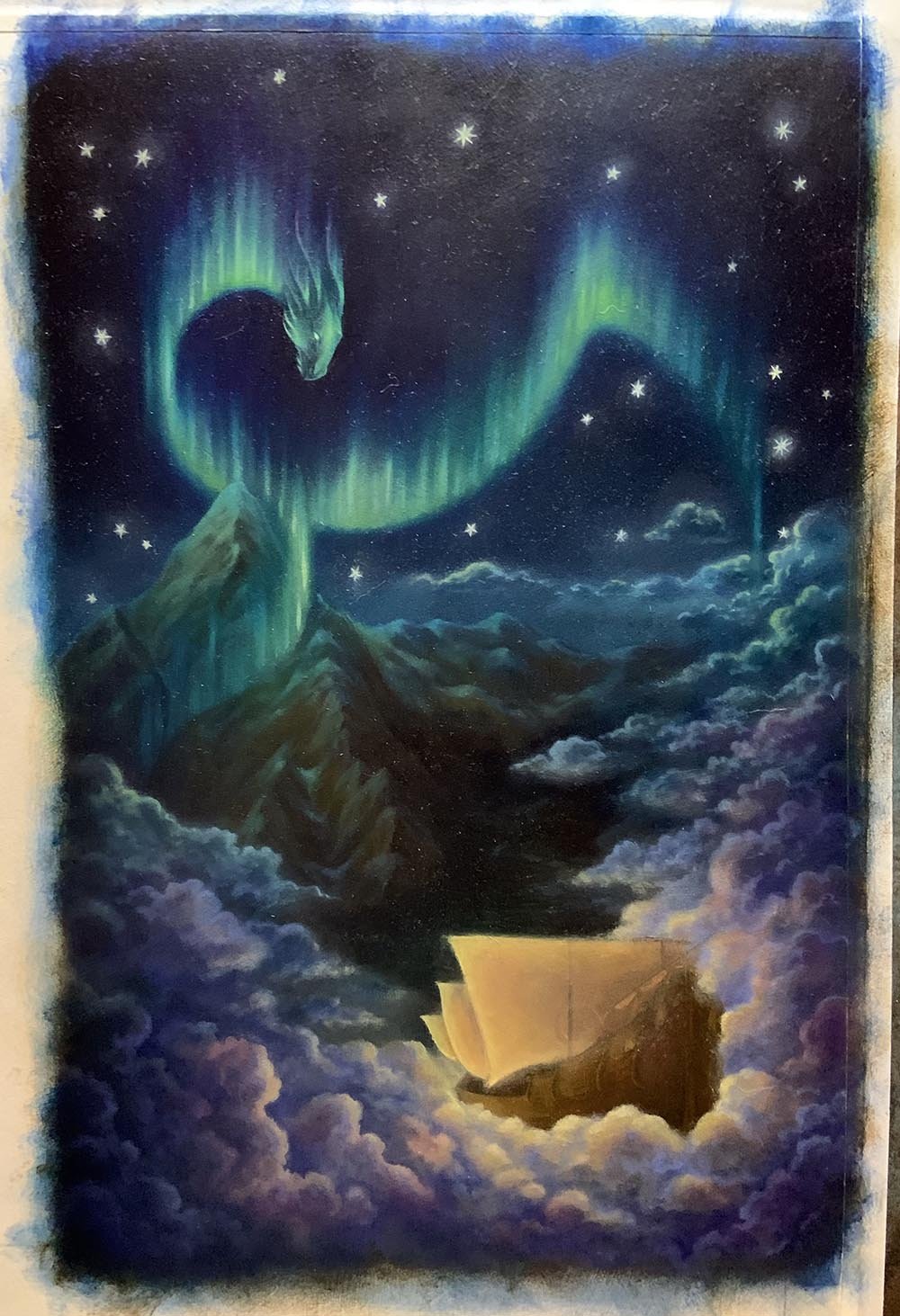
Color, glorious color! This is one of the first glazing passes (a tiny amount of color mixed with walnut oil alkyd), more to establish tone and color balance than final rendering. In this pass, I focused mainly on getting the greens and teals of the aurora established, picking out a few highlights in aqua and light green.
Auroras are notoriously tricky to paint, as they move and shift color constantly. For the aurora here, I drew both on Kathy’s memories of watching auroras when she lived in Alaska, and my own from Northern Norway. To mimic the effect of bending, moving light, I glazed alternating sections of the aurora warm (Pthalo green, yellow tint/Old Holland yellow-green) and cool (cobalt turquoise/indanthrene blue/Scheveningen blue). I then blended ultramarine, quinacridone magenta, and ruby violet into the upper reaches of the light, where it blurred into the sky. This deepened and contrasted the colors of the aurora while adding visual interest to the dark night sky.
At this stage, I also started to establish the warm light glowing from the golden ship. I ended up toning down the warm violets in the clouds, as they distracted too much from the auroras.
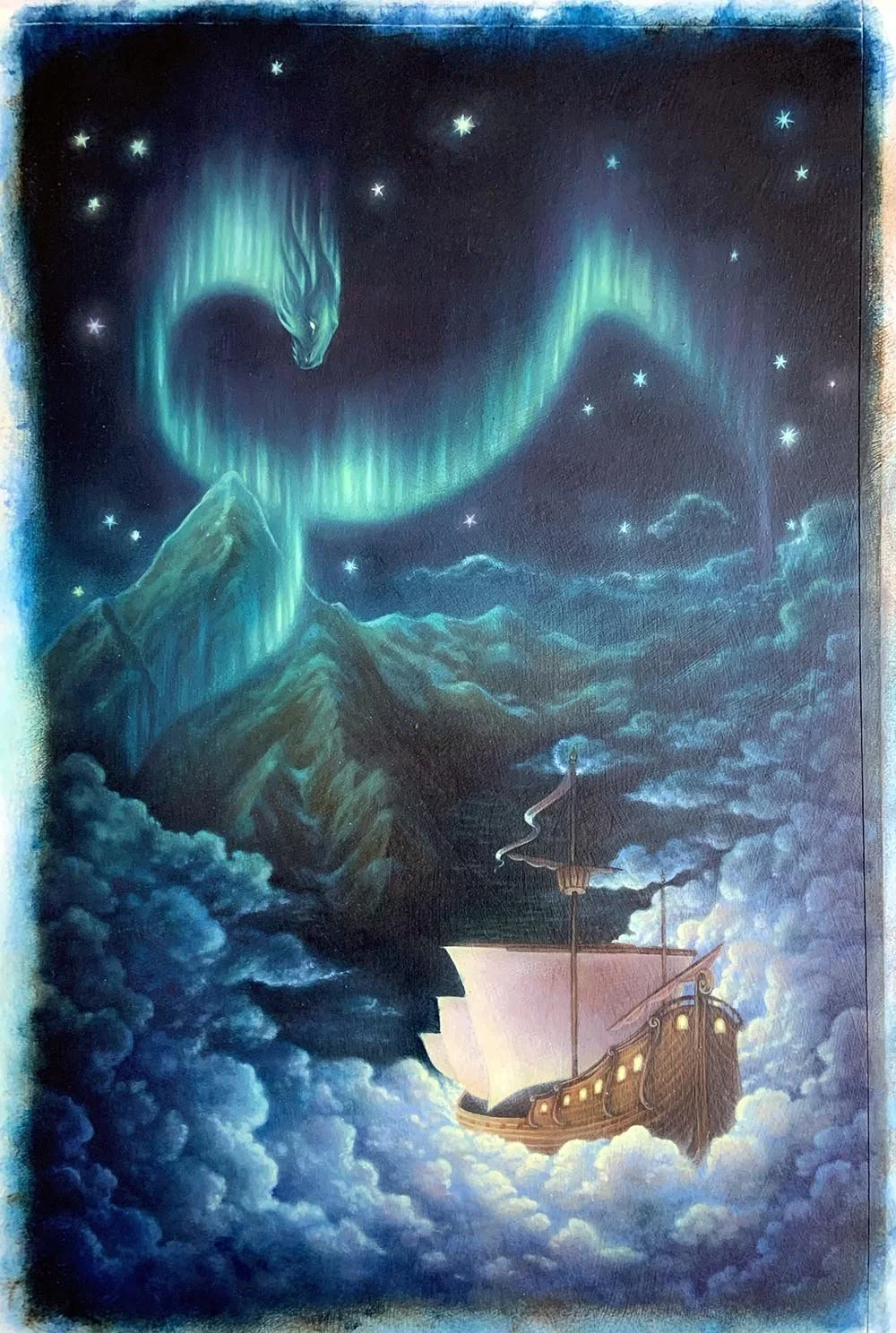
The human eye will always see yellow first, so I aimed to have the viewer’s gaze start in the foreground, with the Hermits’ ship, before climbing through yellow-ish sepias and greens up the mountain, and finally sweeping upward into the lime green/nickel titanium yellow highlights in the auroras.
I glazed the stars several different colors (magenta, aqua, yellow-green, blue, etc.) to make them appear sparkly and give the sky depth.
Every painter has a different approach to black. Personally, I prefer to mix my own black (usually ultramarine + burnt umber) in order to make these dark hues richer and deeper, since I find a true Mars black to be rather flat, sometimes even chalky. This also allows me to create color harmonies throughout a piece by layering this same combo (ultramarine + burnt umber, etc.) into all the shadows, at varying opacities and intensities. For instance, I used this same “shadow recipe” on the ship, mixing in small amounts of burnt sienna, Italian brown-pink lake, and Alizarin crimson to harmonize with the warm browns/roses/golds of the rest of the ship.
For me, the trick to painting light is not painting the light itself, but rather the effects of the light (this is also a helpful idea to me in writing). In this case, I focused on trailing the greens of the aurora down the mountain and across the fjord, while the clouds bounced the golden light of the ship up toward the sky, eventually blending with the blues to create subtle aurora greens. I also had fun hiding a tiny glowing crescent moon at the tip of the mast.
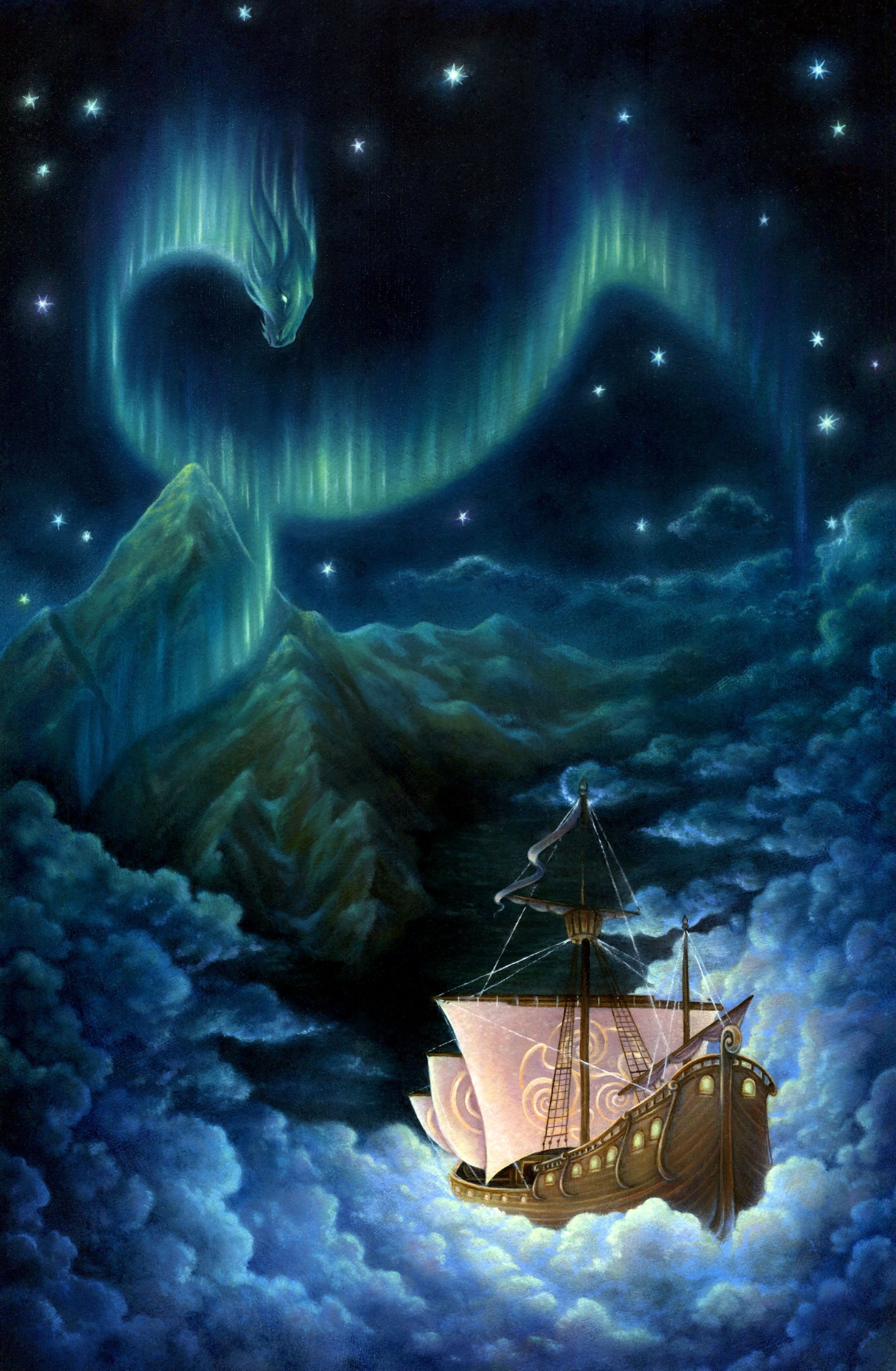
One of my favorite parts of a painting is rendering the final details and highlights (partly because this means I’m almost done). Kathy and I worked together to design the Hermits’ sigil on the mast of their ship (which you might find hidden on other parts of the book…). The sigil is a mix of a Celtic triskele and the dragon shape of the aurora: rounded, flowing, harmonious, and inclusive.
Details painted, all that was left was to varnish! Unfortunately, the ship’s rigging wasn’t 100% dry when I varnished, so I quickly repainted it before the varnish dried. Every painting is a learning experience, right?
I will always be grateful to Kathy, not only for trusting me with such a dream project, but also for her collaboration, creativity, and friendship developed over the process of creating this book. While there are parts I’m not happy with on this cover (the clouds, for one), that just means I have more room to grow. My goal is to improve, if only in small ways, with every painting.
Kathy, Kristy Zacharias (book designer extraordinaire), and Freesia Blizard (book production wizard) truly worked magic designing and producing the final book (I had nothing to do with it). Available now for purchase HERE.

