Fuzzy Buzzy

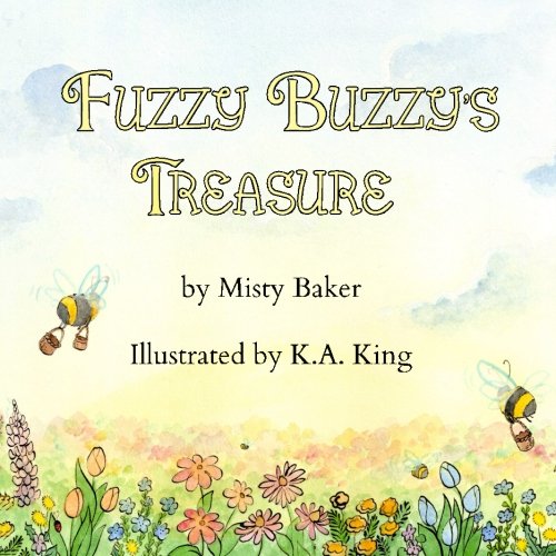
I'm so happy to announce that the children's book I illustrated for Misty Baker is now out!  It's an adorable story about a bumblebee named Fuzzy Buzzy who finds a beautiful field of flowers but learns that to help the flowers survive, she must share her new find with all the other bees.

fuzzybuzzycover

You can purchase your own copy of the book (paperback or for Kindle) HERE

p2_final_sm.jpg

I painted the spreads in watercolors, with pen and ink for the lines work.  I really like using sepia ink for my inking, because it's much less harsh than black ink, and gives a warmer, more approachable look to the painting.  In fact, I very rarely use pure black ink in my work.  If I want a cooler look than sepia, I'll mix a 1:1 or 1:3 solution of blue and black inks.  It gives it a cooler, darker tone, but is not nearly as stark as pure black.  I'll write another post soon about what supplies I use and how I mix my colors!

beeflowers

You too can help save the bumblebees!  One easy way to do this is by planting a bee-friendly garden.  Not sure what kinds of flowers bees like this?  Try to stick to native plants and even find new bee-friendly flowers here: http://beekind.bumblebeeconservation.org/finder

And now for some behind the scenes looks!  Have you ever wondered how your favorite children's books come to life?  I'll walk you through the process with one page, where we go from sketch to finished painting.

The first thing I did after reading Misty's initial manuscript was to start sketching.  This is a really fun part of the process because you get to explore lots of different looks and styles for your character(s).  Nothing has to look pret…


The first thing I did after reading Misty's initial manuscript was to start sketching.  This is a really fun part of the process because you get to explore lots of different looks and styles for your character(s).  Nothing has to look pretty (and often doesn't), as long as you can get your ideas across.  I'll generally spend a day or two doing nothing but sketch, just trying to get as many ideas as I can down on paper.  You can revise later!  Right now, just get it all down on paper.

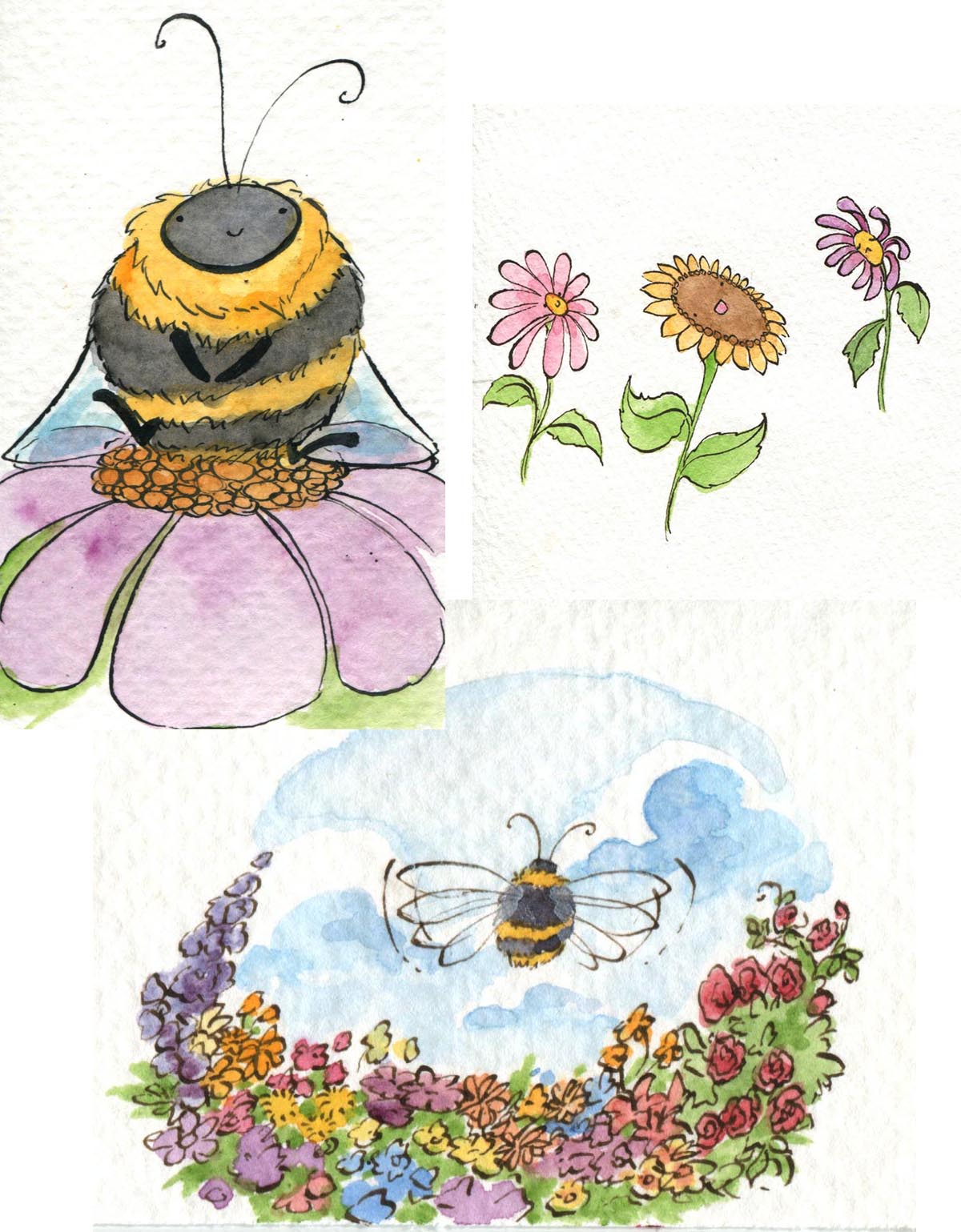
 Since I think primarily in color, I decided to do some watercolor sketches as well.  As you can tell, not all ideas made it into the final book.  The important thing at this stage is just to have fun playing with all the possibilities!


Since I think primarily in color, I decided to do some watercolor sketches as well.  As you can tell, not all ideas made it into the final book.  The important thing at this stage is just to have fun playing with all the possibilities!

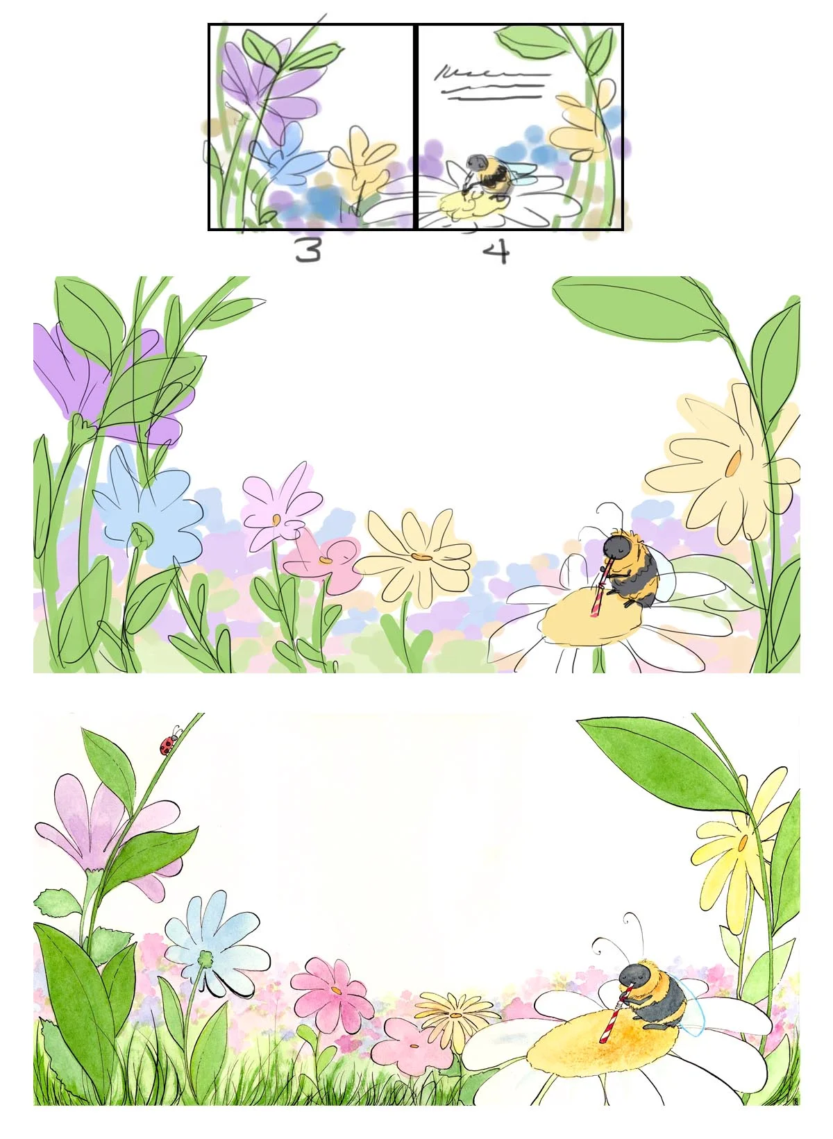
From there, I began storyboarding the book.  While it might seem intimidating at first, storyboarding is a great way to see the book laid out all together so that you can better control the flow of its illustrations and color palettes.  On…

From there, I began storyboarding the book.  While it might seem intimidating at first, storyboarding is a great way to see the book laid out all together so that you can better control the flow of its illustrations and color palettes.  Once the storyboards have been approved, it's time to start in on the individual pages!  Most of the pages in Fuzzy Buzzy are two-page spreads because I wanted to really give the reader a feeling that they were looking out over a vast field of wildflowers.  Before I ever set brush to paper, though, I created digital comprehensives (or comps) for each page, to get everything laid out and make sure that my values and colors made sense and matched the author's idea of the story.  Also, watercolors are incredibly difficult if not impossible to edit later on, so I needed to be sure that everything looked a-okay before I began!  Then, much sketching, inking, and painting later, we arrive at the final painting.  This painting is then scanned in and cleaned up digitally so that it's ready for formatting!  And there you have it: illustrating children's books in a nutshell.


Want to learn more or have specific questions about the book?  Just send me an email at kakingillustration@gmail.com ! 


The Color Master

As most of you know, I'm a pretty die-hard fan of watercolors, but that's not to say I don't enjoy experimenting with new mediums from time to time.  Sometimes that choice is voluntary, other times, such as when one is in school, that choice is not.  And despite the frustrations of trying to blindly find your way around a new medium, I believe that, in the end, it helps to further one's development as an artist.  Sometimes that development just means that you're very cranky for a while as you struggle to get your paintings to turn out as something other than colorful glob-monsters.  

One of my final courses for my master's degree was a narrative painting class, and in order to replicate the look (and suffering?) of the great narrative painters, we had to work in oils.  For my project, I chose to illustrate Aimee Bender's short story "The Color Master" from the anthology My Mother She Killed Me, My Father He Ate Me  (which, incidentally, is a fantastic collection).  This is the part in the story where the Color Master's apprentice works to put anger in the dress so that the princess will not marry her father.  The emotion is so strong in the story, and the women's anger so compelling that I couldn't help but paint it. 

final1.jpg

I really haven't worked in oils since high school, so I had a lot of learning to do, especially since oil techniques are nearly opposite of watercolor techniques.  Especially when you're working on a giant 36x48" canvas (okay, well, giant for me who prefers to work pretty small).  In the end, there's still a lot I would like to fix/improve on with this painting, but sometimes, you just have to be done and stop swearing at your canvas.

princess
apprentice


Sketchbook Studies

I make an effort every week or so to do at least one realistic watercolor study.  Not only does this keep my watercolor skills from rusting if I happen to be working in another medium, but more importantly, helps me to continue to grow and improve as an artist, as it trains both my eye and my hand, so to speak. 

Speaking of hands, they are, in my opinion, one of the most expressive features and have always been difficult for me to paint.  So I started off the week trying to rectify that:

hands

I love all the subtle colors hiding in skin tones, especially in the hands.  You get everything from rose-hues at the fingertips and knuckles to the pale blues and teals of veins on the backs of the hands (at least, with crazy pale skin tones like mine you do).

It being springtime now has also made me crave pinks: light pinks, hot pinks, warm pinks, I love them all.  I've also enjoyed getting to break out my favorite wearable pinks from Chanel: at the moment, Rouge Coco Shine lipstick in Candeur and C…


It being springtime now has also made me crave pinks: light pinks, hot pinks, warm pinks, I love them all.  I've also enjoyed getting to break out my favorite wearable pinks from Chanel: at the moment, Rouge Coco Shine lipstick in Candeur and Coco Mademoiselle parfum (my top pick as far as perfume goes).  So I figured, why not experiment with some quick sketches?  There is something so effortlessly chic and feminine about light pinks, I think.


Disney themed

So it's really no secret that I absolutely love Disney: from classic Disney movies to DisneyWorld to the modern Animation Studios.  As I've been trying to sketch more, I thought I would channel some of their bright, colorful aesthetic into some quick paintings:

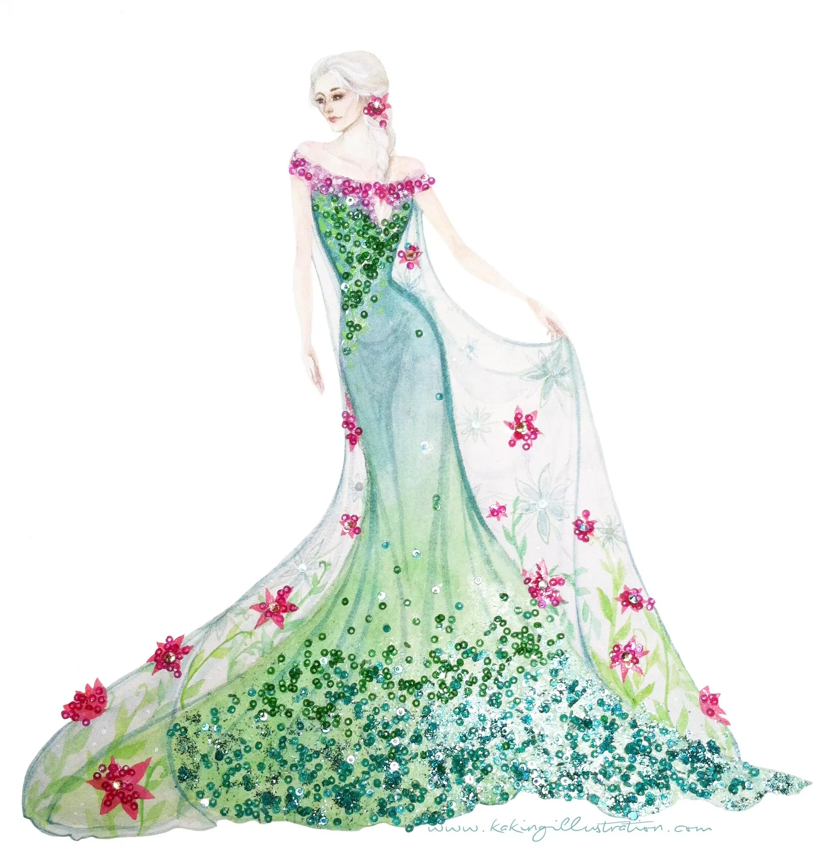
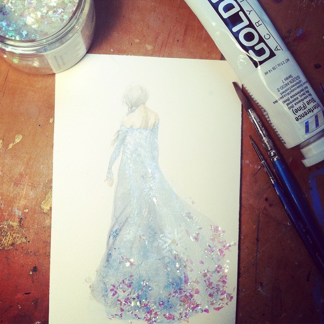
How could I resist painting Elsa's gorgeous new dress from Disney's "Frozen Fever" ?

How could I resist painting Elsa's gorgeous new dress from Disney's "Frozen Fever" ?

My dear friend Lindsay of Tales of Sheaves

My dear friend Lindsay of Tales of Sheaves

The beautiful Charis of CharismastarTV

The beautiful Charis of CharismastarTV


New Site, New Adventures

I am notoriously bad at using Dreamweaver.  So bad, in fact, that it likes to crash almost as soon as I open it, just to save us both some trouble.  Thus, after playing around with a few new website designs and design interfaces, I give you, dun-dun-duuuun, the new site!  Hopefully this one is much easier to navigate.  Plus, I've added lots of ways for you to follow my creative journey, such as on Facebook and Tumblr, as well as on Instagram @akkaiyan .