Artist Interview: Nick Fair

To make up for my lack of blog posts recently, you get 3 this week! 

Recently I had the pleasure of interviewing multi-talented artist and graphic designer Nick Fair.  He shared with me some of his insights on creativity and finding inspiration all around. 

nick

1. What/who do you find to be your biggest source of inspiration?

Inspiration is a funny thing- it takes many forms. As a kid, I took a huge amount of inspiration from the artist R.K. Post and his twisted creatures and goth stylings, as well as illustrator/designer Syd Mead and his futuristic environments. However I’m equally inspired by utterly erroneous things, like the way a speaker is shaped in an office I’m sitting i, or the pattern on a butterfly I snap a photo of on the way to lunch. Where individual artists have shaped my overall aesthetic, random happenstances shape individual pieces.

2. What's your favorite medium to work in?

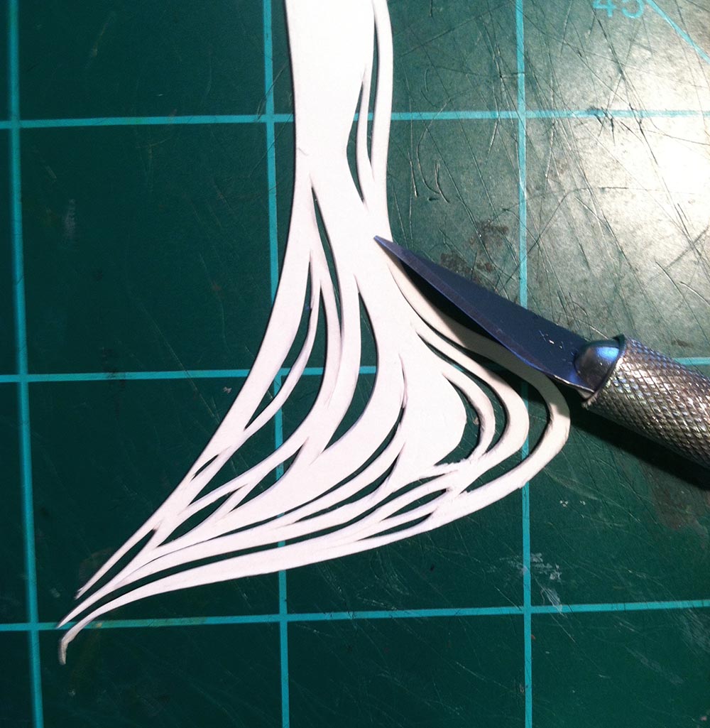
In college, my professor called me a ‘paper tiger’, because all I wanted to do was sketch. I’ve been drawing in pencil and inking with fine-point pens for a long time, and my favorite paper to use is bristol because I have a habit of engraving the paper, much to the detriment of my tools. I use a cintiq tablet for digital work and for my coloring process, but it’s slow runnings transitioning from pen to digital when it lacks the subtle feedback of a physical medium.

nickconcept

3. Any new mediums you're itching to try?

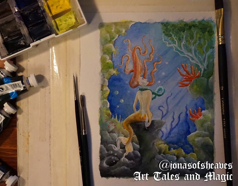
I’ve been trying to get more into watercolor and acrylic, or just painting in general- I guess you could say I’m itching to succeed with those mediums. At some point I really want to try oil painting, but it’s a little cost prohibitive to just pick up without real direction. I’ll get it eventually.

4. What would your dream project be?

Dream project for the long-term? Be a creative lead on something with world building and a high CGI budget- probably a movie or video game. The idea of creating an immersive world is too tantalizing- like the movie Avatar, but even cooler. Dream one-man project? Probably producing a full comic series.

nickship

5. Describe your studio/workspace. What would you change, given the resources?

Funnily enough, I’m currently in the process of transitioning where I live, so my new studio will be a bit different than my last one, but as it doesn’t exist… I’ll describe my last one. I had a dual-monitor set-up on an L-desk with my Cintiq and another HD screen, and a drafting table to the right. The wall was covered with all of my tools- tape, S-curves, rulers, scissors, etc, and then I had a series of drawers underneath just bursting with Prismacolor markers, pencils, pens, and paint tubes, with bookshelves of design and art books on the back wall (along with more than a few comics). Unlike that studio, which had to double as a living room, my new studio will literally be entirely devoted to being just that- whiteboards on the walls as well as some big windows, because I find that natural light is key in really getting the right brain engaged in a project. If I had the money, I would probably expand into 3D printing, and maybe get a kiln and a nice easel, honestly.

6. Do you like to warm up before drawing? If so, what fun exercises do you work on to get in the zone? (ex. Noun generator, word games, etc.)

I never actually ‘warm up’ in the classic sense that a lot of artists I know do. In general I plunge head-first into any project right where I left off, leaving some days where I sort of frustratedly doodle nothing of value, and others where I come out of the gate swinging (to mix my sports metaphors). That being said, getting in ‘the zone’ is all about the right space. I usually light incense, then put on talk radio, podcasts, or ambient music in the background to keep my brain from getting too hyper focused but not distracting enough to detract from my work. I’ll often browse the web or look through books for 10-15 minutes before starting a session, though, to get my mind in a place of visual appreciation and attuned to the style and look I’m going for.

7. What do you find to be the most difficult part of being a professional artist?

Interesting question- there’s lots of places to falter as an artist, and there's’ lots of ways to falter as a professional anything, and they’re usually unrelated. Lots and lots of utterly amazing artists out there that I know have little to no actual business sense, and it’s not enough to just be good, or even great at what you do. You need to get your name out there, and get your work in front of people and be fearless about it. It’s like a political campaign, but you’re just running PR for yourself, and if you’re working on being the best artist you can, it’s hard to make time for it. But it’s so, so necessary and important, or your work will sit on your unviewed portfolio site or in your studio for all eternity. Being a professional artist means accepting the ‘professional’ part is just as important as the ‘artist’ part.

nicklion

8. What's your favorite thing to draw/paint/create?

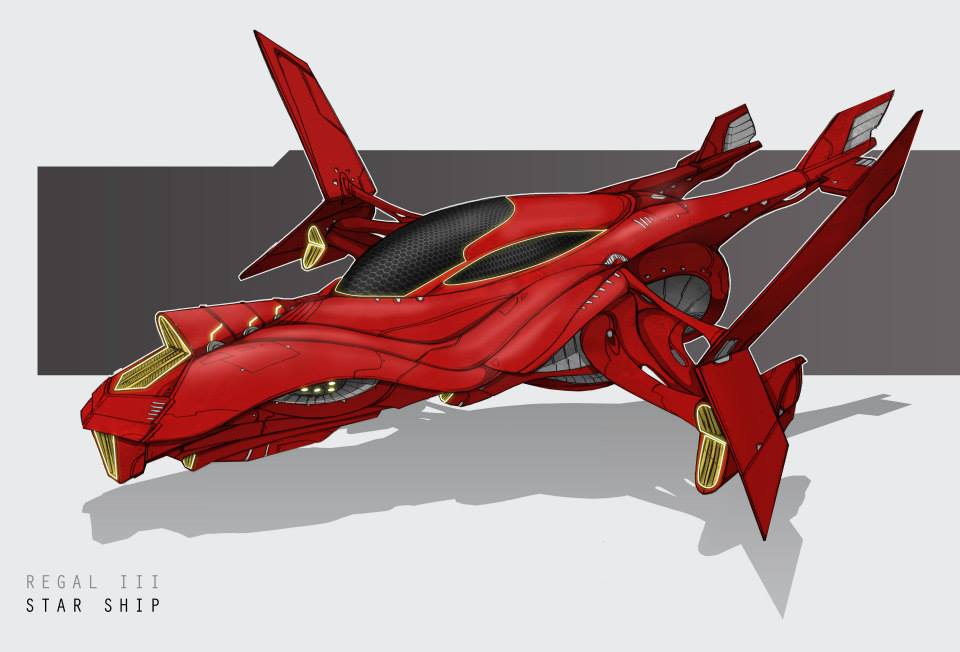
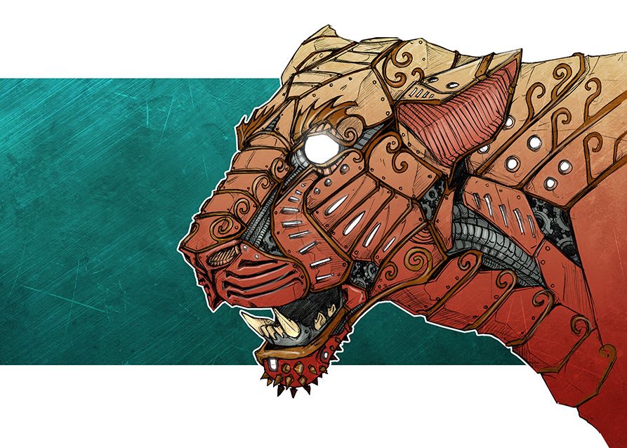
My favorite thing and the easiest thing for me are quite different. I enjoy being able to make a quick piece that stands on its own- so wiley, weird creatures or robots are where I’m at if I want to ‘succeed’ easily. But my favorite thing to draw is really just something unlike anything else I’ve drawn before. It goes against the usual mantra of ‘repeat, repeat, repeat’ when it comes to mastering an art style, but I adore plunging into and succeeding at creating something that’s still mine but different than anything else I’ve ever made. It makes life difficult, sometimes.

9. How do you prevent/combat artist's block? Do you have tried-and-true methods of nurturing your creativity?

There’s no way I know to prevent the onset of artist’s block (and believe me, I wrote a thesis on it), but combating it once it’s started, and finding ways to trigger a creative mindset in what I (and the world of psychology) call ‘flow’, is totally possible. The key is knowing the levels at which your mind functions- there’s the part of you that is entirely mechanical, in a sense, where you know how to put pen to paper. Then, in contrast, there’s the parts of your brain that want, either to create something or evoke something, or utilize the eros energy you have to a specific end. And when you have one of these and not the other, it leads to the block- wanting to make but being unable. Everyone gets it, and it’s rooted in a lot of factors. Conversely, if you utilize mechanical action without direction, you get aimless doodling, which can sometimes be fun, but usually doesn’t result in something profound. I tend to take a step back if I’m ever blocked and I force myself to do something else, in a different environment, that will wake up the part of my brain that I need- controlling external stimuli. Social activity tends to give me the drive I need to utilize my mechanical action, and doing something physical, like exercise, usually puts me back in-synch with my hands and lets me get back to drawing properly. Of course, it’s different for everyone- but always notice when you have those moments of perfect mind and body harmony to create a piece, and then try and recreate those conditions when you don’t.

nickburnout

10. Just for fun: Dragons or unicorns?

Dragons, because Reign of Fire was the best worst movie when I was young.

11. Best advice you have for emerging artists?

The classic advice is ‘never stop drawing’, so I won’t tell you that, because everyone already has. Instead, I’ll just say that you should never throw out any of your art. I can’t tell you how many badly rendered great ideas I had as a kid that I’ve used in my modern pieces, and how many pictures that I thought were garbage and I left half-finished a month ago ended up in my portfolio when I looked back and finished them later.

You can visit Nick's profession websites at:
http://www.nickfairdesign.com

http://www.inklingart.net/

or visit his collective studio, Marshmallow Dumpling Studios on Facebook.

You can also keep up with Nick via these social media sites:

LinkedIn: Nicholas Fair

Pinterest: nickfairdesign

Twitter: NickFairDesign

Artist Interview: Jonas Karlsson

Since, as a working artist, I'm not able to post 99% of what I'm currently working on, I thought it'd be fun to do a series of artist interviews with artists whom I know and admire. I'm always curious about other people's views on creativity, art, and inspiration. 


For my inaugural post, I decided to interview my friend Jonas Karlsson, a brilliant Swedish painter and illustrator.

jonasofsheaves

Since I'm not much of a journalist, I formed a list of 11 questions, and here's what Jonas had to say:

1. What/who do you find to be your biggest source of inspiration?

I am fascinating of exciting stories so there is where it starts for me. Every painting I do must have an interesting background story. I want the painting to reach further than its own frame and if people get the story it tells its like they get a piece of the painting to bring home.

2. What's your favorite medium to work in?

Watercolour is my favourite medium. I just love how the colours' comes to life when adding water. It's something magic about it. I have tried acrylic and oil as well but overall it didn't click for me as watercolour did. I do love all the unique effects different mediums have and even if I choose watercolour I think I paint with it in my own way, almost as if it was a mix of all mediums. It's like the bees who is theoretically to heavy to fly but believe they can, and that's how they fly. I believe I can paint watercolour as if it was any other medium and that's how it works for me.

3. Any new mediums you're itching to try?

I would like to add ink in my paintings. It seems to add something extra, a very interesting texture.

jonaswip

4. What would your dream project be?

I think it would be to work with people who can reach out in different directions than I can. To be in a project when everyone doing what they are best at and the result turns out to be something awesome that no one in the  group would have been able to do by them self. I would also love to take more time to write down my stories and release books with my own illustrations.

5. Describe your studio/workspace. What would you change, given the resources?

My workspace is very small so someday I hope I will be able to have my very own art studio. But at this instant moment I try to just have the most important things i really use. Besides the actual brushes and colours all I need is a desk, some wifi, a cup of coffee or tea with a small plate of a wide selection of dark chocolate. That is what keeps me going.

6. Do you like to warm up before drawing? If so, what fun exercises do you work on to get in the zone? (ex. Noun generator, word games, etc.)

I never really warm up, I realize that now when I think about it. If I performed sports as I perform painting I guess I would be all bruised up and have the worst pain ever in my limbs. But some good music can always get me in the zone. But that is just when I paint because if I write i rather have it silent.

jonascottage

7. What do you find to be the most difficult part of being a professional artist?

To be professional is the most difficult part!  I have never been in any art school or anything like that, and sometimes that can play silly games with my mind. I believe that you don't need to go through an art school to be able to call yourself an "artist". But of course that can be a big help since you have a degree to show people and so forth. So many pros there. Anyway as an “unschooled” artist you have to just trust yourself and go from there.

So I would say the most difficult part of being a professional artist is when you think less of yourself for not being schooled. That can takes an awful lot of energy and time away from your creativity.

8. What's your favorite thing to draw/paint/create?

I love to involve trees and animals here and there. Some eyes in a dark corner and just random details of any kind. I also begin to love dramatic shadows to add some atmosphere. When I think about it I guess I am more into a certain atmosphere in a painting than certain things.

jonasforest

9. How do you prevent/combat artist's block? Do you have tried-and-true methods of nurturing your creativity?

If i have a creative blackout i have noticed myself to not pressure myself, just go out do something else, using the time instead of forcing creativity back to me. It is very nice to just read a comic book, or enjoy a movie, or go out to a nice café with no stress, because I know creativity comes and goes, it will not be blocked out for forever. While being in the middle of a painting it is different though, since a certain part of the process always is less exciting than others. At those times i just work through it to reach the more exciting parts of the process.

10. Just for fun: Dragons or unicorns?

If I had to pick one I would probably pick a dragon because there is a lot of things about them that I love. I imagine their scales as some kind of gem or jewellery kind of material who can change colour depending on how the light hits it. Only that is pretty awesome. I like that there is both good and bad dragons. They love shining things and can have a wide variety of colours. I wouldn't mind putting a unicorn horn in its face though. That could become a new kind of dragon, a “unicorn dragon”.

jonasmickey

11. Best advice you have for emerging artists?

Never give up, believe in yourself because you can accomplice things you didn't know you could. If your schooled or not doesn't matter. It's all from the inside, your heart and mind.

You can follow Jonas on Instagram @jonasofsheaves or use the Instagram hashtag #jonasofsheavesart for more art.

Visit his blog at: www.arttalesandmagic.worpress.com


Supplies

I get asked a lot about my supplies: what I use, what I prefer, and what the benefits are of one type of paint vs. another.  So, I thought I'd write up a post about it (complete with pictures!).  Keep in mind, this is just what works best for me and each artist definitely has their own preferences.

Most art supplies come in three different grades: craft (the cheapest and lowest quality), student (good for beginners/hobbyists), and artist (the highest quality, and thus, most expensive). 

Watercolors

Almost everything I do is based in watercolor, whether it's a painting, a doodle, or even a papercutting.  For a basic set, I really like Winsor&Newton's field set.  This is also great for traveling.  Winsor&Newton also make a good set of tube colors which also works well on the go. 

What's the difference between cake and tube watercolors?  Tube colors tend to be more intensely pigmented/vibrant, whereas cake colors tend to be lighter/less saturated.  Of course, cake colors can be mixed into very dark shades, but generally, it's easier just to use tube colors for darker/brighter hues such as ultramarine, burnt umber, carmine red/yellow, etc.  Once tube colors dry out on your palette, you can also re-wet them and use them just like the cakes!  (This is also handy if you cat happens to bite through one of your tubes, causing all the paint inside to dry...)

My favorite watercolors though have to be Mijello Mission Gold's tube colors.  They are the most highly pigmented watercolors I've ever seen and oh are they a dream to paint with!  They're a bit on the pricey side, but the tubes are large, so last quite a long time.

The lovely thing about watercolors is that you really don't need many colors outside of a primary set.  Most colors can be mixed with just a little practice!  Of course, there are a few exceptions to this, such as bright aqua blue, spring green, fuchsia, etc.  But, the more you experiment, the more you learn that with watercolors, less is more.

watercolors

I tend to have very messy palettes, which is fun because it means I can usually find whatever color I need already there).  Of course, if I want a color to be really bright and pure, I'll wipe off a corner of the tray to use so it doesn't get muddied up accidentally.  I tend to like reusable/seal-able palettes like this one by Mijello (also very handy if you have cats), which are  good for travel and are easy to clean/reuse.  Regular plastic palette/styrofoam trays (like meat comes packed on) also work quite well.


Gouache

I get asked a lot about the difference between gouache and watercolor.  Basically, gouache is brighter/more pigmented and more opaque than watercolor.  Gouache tends to be favored by graphic designers and illustrators with a bold, flat style because of its vibrancy and the ease with which you can control its opaqueness.  Water-based gouache acts very much like tube watercolors in that you can use it straight from the tube for very vibrant, opaque layers, or once the paint has dried, just re-wet it and use like cakes for thinner/lighter layers.

There are two types of gouache: water-based and acrylic-based.  Unlike water-based gouache, acrylic-based cannot be re-wetted, but is incredibly bright and fun to paint with.  

For water-based gouache, I like this set by Winsor&Newton.  As with watercolors, most colors that you would want can be mixed with a bit of experimentation, with the exception of colors like aqua blue, fuchsia, bright green, and light lemon yellow.  

For acrylic-based gouache, Holbein has an amazing range of colors.

gouache

Brushes

For me, as with most artists, brushes are a career-long collection.  Namely, because nice watercolor brushes can be ludicrously expensive, such as my very favorite set by Escoda.  These brushes are the bee's knees.  Seriously.  They're like painting with a cloud.  A very fine, precise cloud.  Ah, brush-y bliss!

I also really like these sable brushes by Winsor&Newton.  However, I don't like using sable for gouache, so these student-grade synthetic brushes by Winsor&Newton Cotman are great.  They are also very good for scrubbing out watercolor, speckling, and other techniques that tend to be a bit harsh on brushes.  (Plus, they're much much cheaper than real sable!)

The size and shape of your brushes really depends on your personal style and techniques.  I tend to like finer rounds/pointed rounds and riggers, because I like doing very delicate detailed work.  You'll just have to play around with different types and see what works best for you!

brushes

Watercolor Paper

As with brushes, different artists prefer different types of watercolor paper.  I really like hot press paper which is incredibly smooth, allowing me to make very soft/smooth gradations of color and put in lots of fine details.  Lanaquarelle's hot press blocks are definitely my favorite, although since they're so expensive, I only use them for final illustrations.  Being lazy, I also prefer watercolor blocks as it means I don't have to stretch the paper, haha!

Occasionally I'll use some of my fine watercolor paper for backgrounds in my papercuttings, but generally, I use Strathmore's mixed media pads.  In fact, most of my papercuttings are made out of this paper, as it takes watercolor and gouache quite well and is also sturdy enough to hold its shape in the shadowbox.  Plus, being relatively inexpensive means that if I don't like how a piece came out, I can just start over and cut out another one!  If you're wanting to layer a lot of color on, however, I'd recommend using an actual watercolor paper, as paint tends to wear off after the 5th/6th coat. 

I also keep a few watercolor sketchbooks on hand for doodling, practice, and when I'm traveling.  Unfortunately, these are all cold press, at least that I've been able to find! 

wcpaper

Papercutting Paper

As I mentioned above, for all the painted bits of my papercuttings, I like Strathmore's mixed media pads.  For mostly flat-colored pieces, like leaves and architecture, however, I tend to use a mix of colored papers.  Sometimes it's just colored cardstock, other times it's textured scrapbooking paper.  Just take a look through the scrapbooking section of any craft store and you're sure to find a wealth of possibilities!  I like to stick to solid colored papers and then just paint on whatever patterns/texture I want, but as I've said, each artist definitely has their own style.  The fun part is playing around with different materials/mediums until you find what's right for you!

paper

Other Tools

Obviously, when working on paintings/papercuttings, it's helpful to have a pencil or two laying around.  Kneaded erasers are also great because you can form it into different shapes depending on the area you knead to erase (get it? knead?).  It's also good for lifting off 90% of the graphite before you start in on a watercolor since, once the paper's wet, there's no erasing.

For papercutting, I also use a few different sizes of x-acto knife (depending on the level of detail), as well as a pair of tweezers for those teeny-weeny pieces.  If you think you'll be doing a lot of cutting, the comfy/ergonomic handle is definitely worth the few extra dollars!  It's also good to always keep extra blades on hand as they wear out quite quickly.

Not pictured: a cutting mat!  This is a must if you're going to be doing any sort of cutting, as it saves not only your table, but also your blades. 

knives

Glue

As with the colorful papers, for these I just raided the scrapbooking section of my local craft store.  I just use a basic Scotch glue for flat-gluing pieces of papercuttings together.  For slightly raised pieces, I use either the foam tape or foam sticky squares (I have no idea what they're actually called).  If something needs to be substantially raised, however, I glue in stacks of foam core strips for more stability. 

If a piece has embellishments, I'll also use either adhesive size or this wonderful glass glue from Sun&Moon Crafts.

glue

Iridescent Paints

Iridescent paints may, in fact, be the most fun part of painting.  And these paints by Golden are just divine.  The fine iridescent gold is especially beautiful. 

iridescents

Embellishments

Sometimes, it's fun to dress up a painting or papercutting with a little extra sparkle and shine.  When that's the case, I usually go for these tiny sequins.  For some serious pizzazz though, I love Swarovski's AB flatback crystals.  And, of course, a touch of glitter never hurts!

I usually use either adhesive size or this wonderful glass glue from Sun&Moon Crafts to attach these fancy bits and baubles, or maybe even a touch of superglue in extreme cases.  This is also where some craft tweezers come in handy!

bling

I hope this guide has been useful!  If you have further questions, just let me know and I'll make more guides/tutorials. 

Summer Details

The bright happy colors of summer are so inspiring and cheery that I find myself doodling them during my lunch breaks most days (when I'm not working on secret book projects, that is).  And, having just returned from a wonderful graduation trip to Walt Disney World, what better way to use that summery palette than with a collection of cute Disney accessories?

dve.jpg

I couldn't resist adding a little extra sparkle and shine to some of these!  What's your favorite part of a Disney vacation?  For me, it's getting to run around the parks like a little kid, taking in all the beautiful details and getting to fully immerse myself in the beautiful world they create!

While in real life, my wardrobe tends to be as monochromatic as you can get, I definitely enjoy the bright and colorful Southern summer aesthetic.  Vibrant colors are hard to pull off when you're paler than a vampire, haha.  That's the great thing about art though, I can surround myself with any colors/settings/ideas that I choose! 

sse.jpg

How will you celebrate this summer?  As for me and myself, I'll dive into dazzling new palettes and try to find as many cheery details as I can in the world around me!

Birds of a Feather: The Colors of Summer

I believe that life should be lived in full color, and that's one of my favorite parts of summer: all the bright, vibrant colors everywhere.  Pink mimosa blossoms on dark green leaves, yellow floats in aqua pools, candy-colored ice cream...  And living in the South, everyone seems to be wearing vivid pink and coral nail polishes, luminous Lilly Pulitzer-style prints, and vintage-style sunglasses in the most wonderful colors.  I've also had lemon-yellow goldfinches and pastel bluebirds outside my studio window recently, so it looks like everyone is in on the trend!  

penguinballoons

It's no secret that I'm a huge Disney fan, with Mary Poppins being one of my all-time favorite movies.  Mostly for the Jolly Holiday scene with the penguins, let's be honest.  So, in anticipation of my master's graduation trip (oh yeah, I graduated!) at the end of this month, I put together a very simple papercutting featuring a very happy penguin and colorful Mickey balloons. 

I think that happy colors are incredibly powerful: they have the power to lift us up when we're feeling blue (ha, color pun!), inspire us, and encourage us to reclaim some of the great joy of childhood.  That's probably one of my favorite parts of Disney: their incredible use of color and their embrasure of the unabashed wonder of childhood. 


lovebirds

And while we're on the topic of happy colors, how about these tropical love birds?  I must admit, I'm generally not terribly fond of birds (except owls), but I do love looking at pictures of brightly colored tropical birds.  I mean, just look at those feathers, June! 

This cute little pair of love birds is for one of my newest papercuttings that will feature a whole mess of tropical birdies.  I've never really painted/cut out birds before (except owls), so this is a fun experiment!  (And if you can't tell, I really like owls, although they are generally not colorful.)

flamingo

My boyfriend and I recently took a trip to the zoo and I was awestruck by the feathers of all the tropical birds.  While I couldn't get good pictures of the smaller whippersnappers, I did manage a nice shot of this flamingo's lovely feathers.  What beautiful texture!  If only I could get my hair that color...


Naiads

Sorry for the silence last week, folks!  My hands have been busy at work on some new papercuttings that I just can't wait to share with you!

naiads

This week I put the finishing touches on the next installment of my Water Spirits series: naiads!  Naiads originate in ancient Greek mythology, though have popped up all over the place since then, such as in pre-Raphaelite art like this painting by John William Waterhouse:

waterhousenaiads

Unlike nereids, naiads are fresh water spirits, generally presiding over a spring, waterfall, stream, or pool.  Mostly though, I just wanted an excuse to paint cute pink water lilies.  I'm such a sucker for cute and pink.

This is definitely my favorite papercutting to date and I look forward to doing more like this!  It has a lot more depth in person and is mounted in a shallow shadow-box frame so that you can peer in at different angles and see all sorts of fun details!  And to think, it all started as this incredibly messy sketch: 

naiadssketch

Here are some behind the scenes looks at the naiads before they were quite so pretty:

naiadwip1

Cutting all the cutouts in the hair is really fun, though gets pretty hard on my hands after a while.  Thank goodness for bubble baths!

naiadwip2

Ta-da!  Not nearly so weird and alien-looking now.  I always start with my characters first and then build the back/foregrounds around them.  It helps me establish the mood of the piece along with the color scheme.

naiadwip3

I'll post sneak peeks of the next papercutting in this series soon!  I promise, it'll be a fun one ;)

Mermaids and Paper Cutting

I've recently gotten into paper cutting and must say I'm rather addicted.  There's something in cutting and pasting colorful papers and decorating them with paint and sequins that makes my inner child undeniably happy.  To me, it's a beautiful marriage of fine art and fun crafts.  Plus, there are just so many possibilities with the medium! 

I've been a huge fan of Brittney Lee's work for a long time, and her paper cuttings are just magical.  So, I thought I'd try my hand at the medium and see what happened.  

My first attempt...was not so great.  It was, however a learning experience, and taught me a lot about what papers/paints to use, etc.  And thus began the mermaids.  I started them back at the end of winter, when I was dearly craving some warm summer sunshine and bright, beachy palettes.   

The first mermaid I kept pretty simple, just so that I could get the hang of how to cut out and layer the various shapes.  The best part about painting/creating mermaids?  You can go all out with the fun colors and sparkle!  After all, I think mermaids have an awfully good time, especially with all that pastel hair.

pinkmermaid

Next up, I decided to tackle something a bit more complex, this time as a graduation gift for my cousin who, I am convinced, is a real-life mermaid.  I started playing around more with cutouts in the various pieces, such as her hair and tail fin.  It's a surprisingly easy technique and simply requires patience and time.  And a paper strong enough to stand up to all the tiny cuts.

bluemermaid

Most recently, I completed this lovely tropical mermaid, who is, thus far, my favorite.  Mostly because of the jellyfish.  I really love jellyfish.  They're just too cute. 

tropicalmermaid

Who knows what will be next?

Fuzzy Buzzy

I'm so happy to announce that the children's book I illustrated for Misty Baker is now out!  It's an adorable story about a bumblebee named Fuzzy Buzzy who finds a beautiful field of flowers but learns that to help the flowers survive, she must share her new find with all the other bees.

fuzzybuzzycover

You can purchase your own copy of the book (paperback or for Kindle) HERE

p2_final_sm.jpg

I painted the spreads in watercolors, with pen and ink for the lines work.  I really like using sepia ink for my inking, because it's much less harsh than black ink, and gives a warmer, more approachable look to the painting.  In fact, I very rarely use pure black ink in my work.  If I want a cooler look than sepia, I'll mix a 1:1 or 1:3 solution of blue and black inks.  It gives it a cooler, darker tone, but is not nearly as stark as pure black.  I'll write another post soon about what supplies I use and how I mix my colors!

beeflowers

You too can help save the bumblebees!  One easy way to do this is by planting a bee-friendly garden.  Not sure what kinds of flowers bees like this?  Try to stick to native plants and even find new bee-friendly flowers here: http://beekind.bumblebeeconservation.org/finder

And now for some behind the scenes looks!  Have you ever wondered how your favorite children's books come to life?  I'll walk you through the process with one page, where we go from sketch to finished painting.

The first thing I did after reading Misty's initial manuscript was to start sketching.  This is a really fun part of the process because you get to explore lots of different looks and styles for your character(s).  Nothing has to look pret…


The first thing I did after reading Misty's initial manuscript was to start sketching.  This is a really fun part of the process because you get to explore lots of different looks and styles for your character(s).  Nothing has to look pretty (and often doesn't), as long as you can get your ideas across.  I'll generally spend a day or two doing nothing but sketch, just trying to get as many ideas as I can down on paper.  You can revise later!  Right now, just get it all down on paper.

 Since I think primarily in color, I decided to do some watercolor sketches as well.  As you can tell, not all ideas made it into the final book.  The important thing at this stage is just to have fun playing with all the possibilities!


Since I think primarily in color, I decided to do some watercolor sketches as well.  As you can tell, not all ideas made it into the final book.  The important thing at this stage is just to have fun playing with all the possibilities!

From there, I began storyboarding the book.  While it might seem intimidating at first, storyboarding is a great way to see the book laid out all together so that you can better control the flow of its illustrations and color palettes.  On…

From there, I began storyboarding the book.  While it might seem intimidating at first, storyboarding is a great way to see the book laid out all together so that you can better control the flow of its illustrations and color palettes.  Once the storyboards have been approved, it's time to start in on the individual pages!  Most of the pages in Fuzzy Buzzy are two-page spreads because I wanted to really give the reader a feeling that they were looking out over a vast field of wildflowers.  Before I ever set brush to paper, though, I created digital comprehensives (or comps) for each page, to get everything laid out and make sure that my values and colors made sense and matched the author's idea of the story.  Also, watercolors are incredibly difficult if not impossible to edit later on, so I needed to be sure that everything looked a-okay before I began!  Then, much sketching, inking, and painting later, we arrive at the final painting.  This painting is then scanned in and cleaned up digitally so that it's ready for formatting!  And there you have it: illustrating children's books in a nutshell.


Want to learn more or have specific questions about the book?  Just send me an email at kakingillustration@gmail.com ! 


The Color Master

As most of you know, I'm a pretty die-hard fan of watercolors, but that's not to say I don't enjoy experimenting with new mediums from time to time.  Sometimes that choice is voluntary, other times, such as when one is in school, that choice is not.  And despite the frustrations of trying to blindly find your way around a new medium, I believe that, in the end, it helps to further one's development as an artist.  Sometimes that development just means that you're very cranky for a while as you struggle to get your paintings to turn out as something other than colorful glob-monsters.  

One of my final courses for my master's degree was a narrative painting class, and in order to replicate the look (and suffering?) of the great narrative painters, we had to work in oils.  For my project, I chose to illustrate Aimee Bender's short story "The Color Master" from the anthology My Mother She Killed Me, My Father He Ate Me  (which, incidentally, is a fantastic collection).  This is the part in the story where the Color Master's apprentice works to put anger in the dress so that the princess will not marry her father.  The emotion is so strong in the story, and the women's anger so compelling that I couldn't help but paint it. 

final1.jpg

I really haven't worked in oils since high school, so I had a lot of learning to do, especially since oil techniques are nearly opposite of watercolor techniques.  Especially when you're working on a giant 36x48" canvas (okay, well, giant for me who prefers to work pretty small).  In the end, there's still a lot I would like to fix/improve on with this painting, but sometimes, you just have to be done and stop swearing at your canvas.

princess
apprentice


Sketchbook Studies

I make an effort every week or so to do at least one realistic watercolor study.  Not only does this keep my watercolor skills from rusting if I happen to be working in another medium, but more importantly, helps me to continue to grow and improve as an artist, as it trains both my eye and my hand, so to speak. 

Speaking of hands, they are, in my opinion, one of the most expressive features and have always been difficult for me to paint.  So I started off the week trying to rectify that:

hands

I love all the subtle colors hiding in skin tones, especially in the hands.  You get everything from rose-hues at the fingertips and knuckles to the pale blues and teals of veins on the backs of the hands (at least, with crazy pale skin tones like mine you do).

It being springtime now has also made me crave pinks: light pinks, hot pinks, warm pinks, I love them all.  I've also enjoyed getting to break out my favorite wearable pinks from Chanel: at the moment, Rouge Coco Shine lipstick in Candeur and C…


It being springtime now has also made me crave pinks: light pinks, hot pinks, warm pinks, I love them all.  I've also enjoyed getting to break out my favorite wearable pinks from Chanel: at the moment, Rouge Coco Shine lipstick in Candeur and Coco Mademoiselle parfum (my top pick as far as perfume goes).  So I figured, why not experiment with some quick sketches?  There is something so effortlessly chic and feminine about light pinks, I think.


Disney themed

So it's really no secret that I absolutely love Disney: from classic Disney movies to DisneyWorld to the modern Animation Studios.  As I've been trying to sketch more, I thought I would channel some of their bright, colorful aesthetic into some quick paintings:

How could I resist painting Elsa's gorgeous new dress from Disney's "Frozen Fever" ?

How could I resist painting Elsa's gorgeous new dress from Disney's "Frozen Fever" ?

My dear friend Lindsay of Tales of Sheaves

My dear friend Lindsay of Tales of Sheaves

The beautiful Charis of CharismastarTV

The beautiful Charis of CharismastarTV


New Site, New Adventures

I am notoriously bad at using Dreamweaver.  So bad, in fact, that it likes to crash almost as soon as I open it, just to save us both some trouble.  Thus, after playing around with a few new website designs and design interfaces, I give you, dun-dun-duuuun, the new site!  Hopefully this one is much easier to navigate.  Plus, I've added lots of ways for you to follow my creative journey, such as on Facebook and Tumblr, as well as on Instagram @akkaiyan .